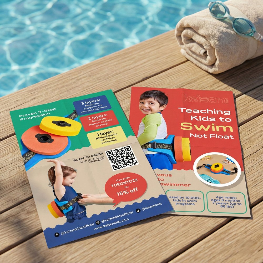
Color and tone: I chose a bold primary palette — coral red, teal green, sunshine yellow — that mirrors the product’s own colorful foam discs. This wasn’t decorative; it creates immediate visual continuity between the flyer and the physical product, which matters at point of sale when the product is sitting right next to the flyer. The palette also communicates child-friendly energy without sliding into the generic pastels that saturate the kids’ product category.
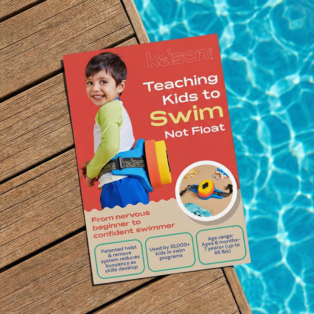
Front side — emotional hook first: The front leads with a full-bleed child photo and a single sharp headline: Teaching Kids to Swim, Not Float. That line does the selling before a parent reads a single spec. Below it, three stat boxes — patented system, 10,000+ kids, age range — provide the rational reassurance that closes the loop.
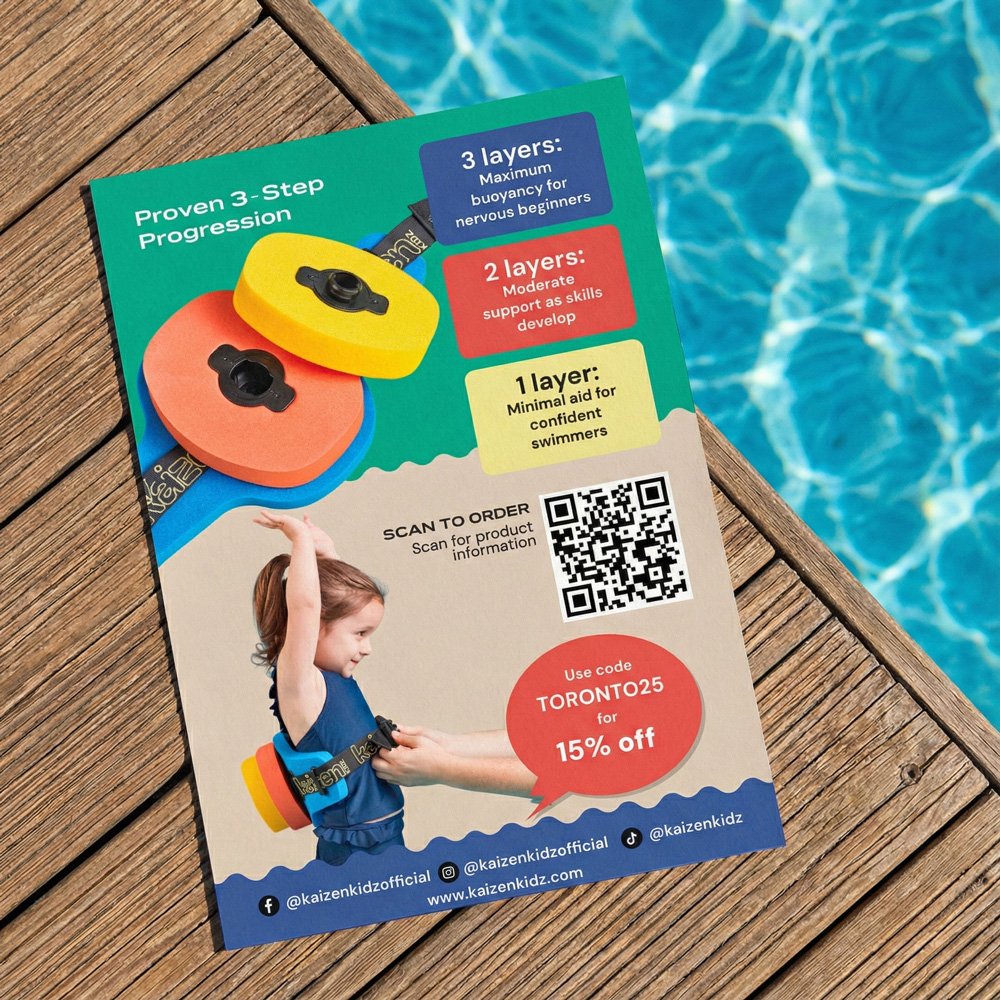
Back side — product education: The back switches jobs entirely. A teal background signals a new section, and the layout walks the parent through the three-layer progression system with color-coded callout boxes that map directly to the physical disc colors. A QR code and a 15% discount code (TORONTO25) give a clear, low-friction path to purchase.