Category: Brand Identity · Web Design · Print & Digital Collateral
Deliverables: Logo · Website · Sales Flyer · T-shirt Design · Social Media Posts
Houston Land Buyers needed to establish credibility fast in a market — Texas land investment — where most competitors look either too corporate or too informal. The client operates in a high-stakes, high-skepticism space: convincing landowners to sell and investors to buy, often through cold outreach. Every touchpoint needed to communicate authority and approachability at the same time, and the system had to work across a wide range of formats: web, print, social media, and even branded apparel worn in the field.
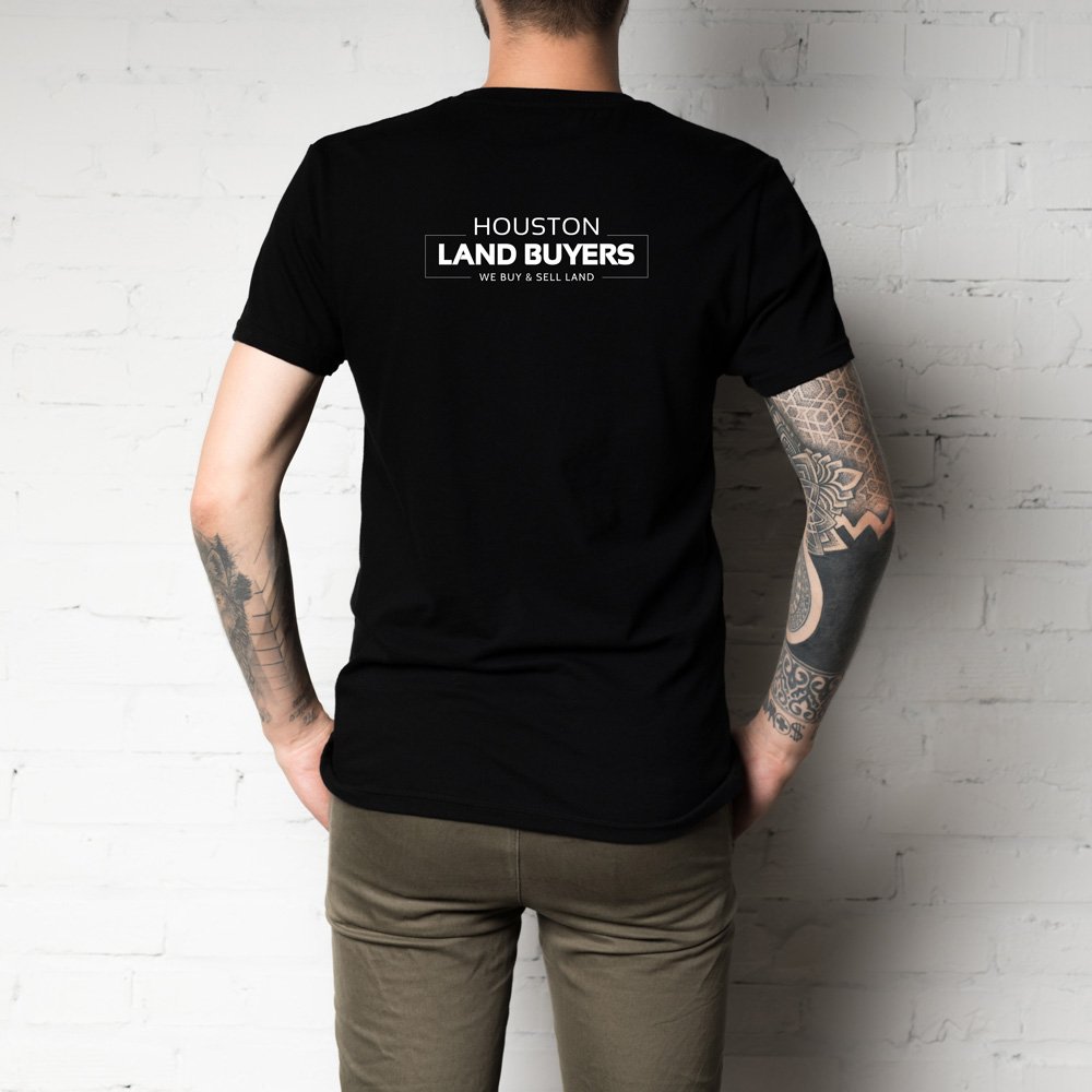
Logo: The mark uses a high-contrast typographic lockup — “HOUSTON” in tight tracking above a bold, boxed “LAND BUYERS” — with a clean rule and tagline beneath. The box device creates a strong, badge-like quality that reads as established and trustworthy at any size, from a website header to the back of a t-shirt. No icon, no metaphor — just confident typography that says exactly what the company does.
Color system: Black and gold was a deliberate positioning choice. In the Texas real estate market, most competitors default to blues and greens. Black communicates premium and authority; gold signals value and success — two things a landowner or investor needs to feel before they pick up the phone. The palette also photographs well on apparel and holds up as social media thumbnails against busy feeds.
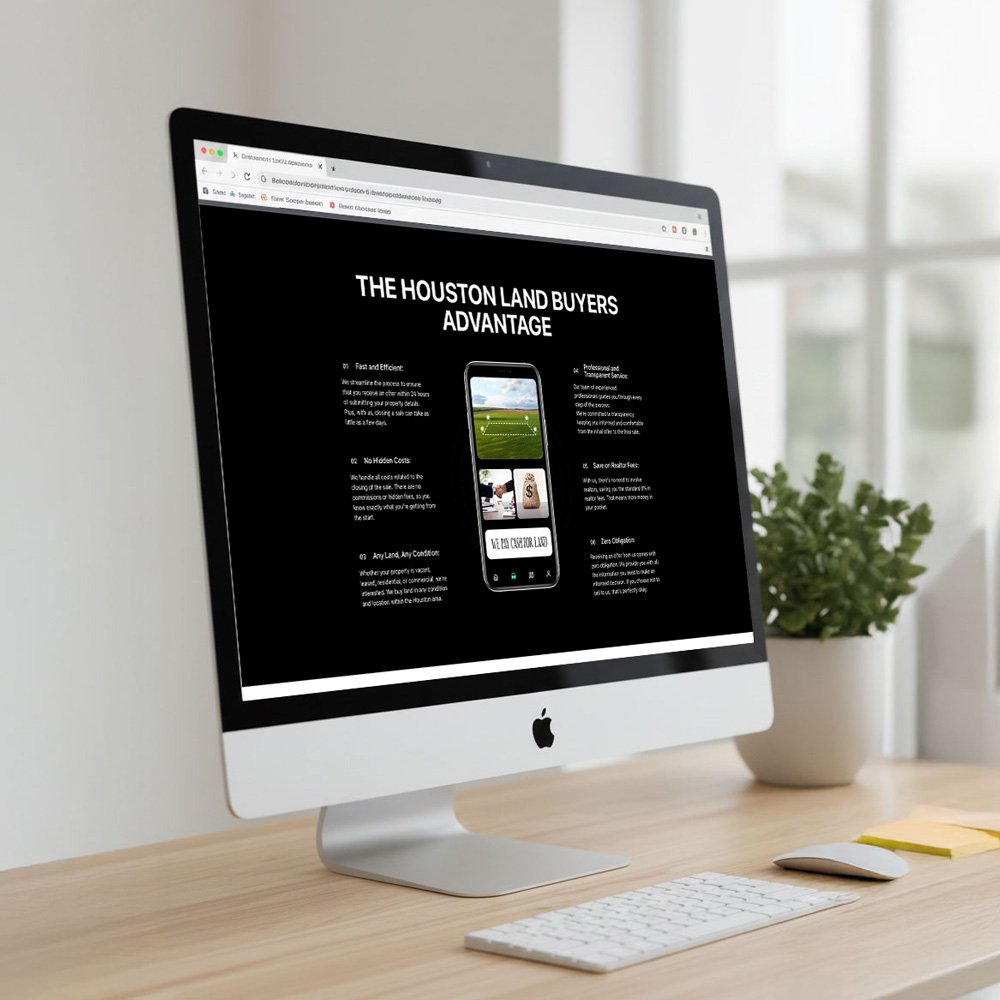
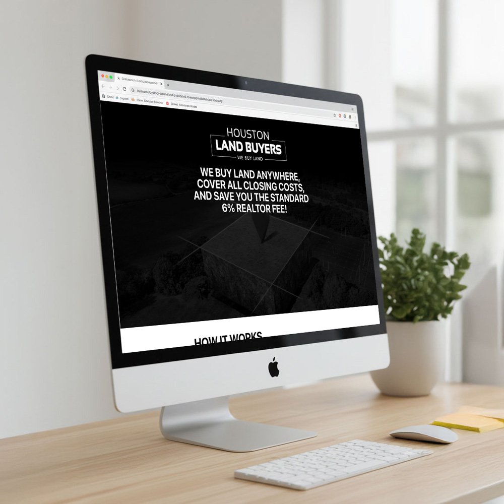
Website: The site leads with a full-screen dark hero and a single benefit-driven headline that addresses the customer’s main pain point immediately. The structure follows a clear sales logic: hook → how it works → advantages → contact. The “Houston Land Buyers Advantage” section with six numbered benefits mirrors the same messaging hierarchy used across print and social, creating a consistent brand voice across channels.
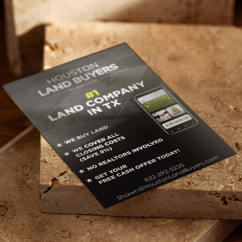
Flyer: Designed for direct outreach — door-to-door or cold mail — the flyer leads with “#1 Land Company in TX” to establish authority instantly, then backs it up with four concrete bullet points. The yellow accent on “#1” is the only pop of color in an otherwise monochrome layout, which makes it land harder.
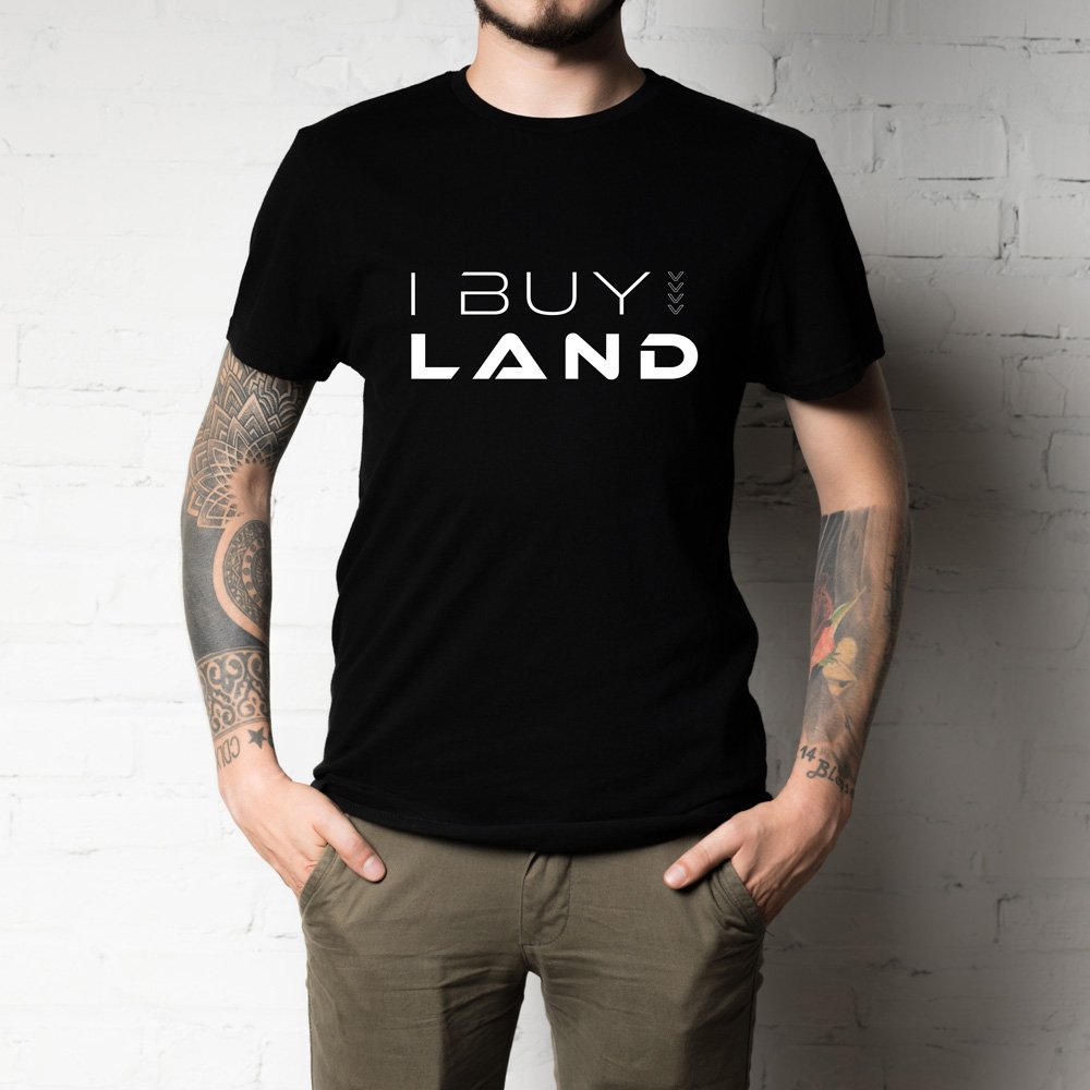
T-shirt: The front carries a minimal “I BUY LAND” mark with a custom arrow detail — a wearable conversation starter for the sales team working neighborhoods and events. The back carries the full logo lockup. Two sides, two jobs: the front opens conversations, the back closes them with brand information.
Social media: Two post formats — one targeting landowners ready to sell, one targeting builders and investors looking for lots — use the same black-and-gold system with different typographic hierarchy. The investor post leads with a bold all-caps headline; the landowner post opens with a warmer, direct tone. Same brand, audience-appropriate voice.
A cohesive, multi-channel brand system that gave Houston Land Buyers a professional presence across every touchpoint — from a live website generating leads to branded apparel worn in the field. The visual language is consistent, scalable, and built to compete in a market where credibility is the first sale.