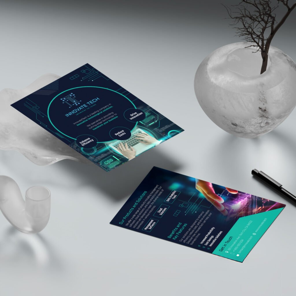
Logo: The mark is built on a geometric “IT” monogram where both letterforms are connected by a circuit-like node system — a direct visual metaphor for technology and interconnection. The construction is rigid and precise, which signals reliability, while the glowing node detail keeps it from feeling cold or corporate.
Color: Navy and teal is a well-established pairing in the tech space for good reason — dark backgrounds push perceived sophistication, and teal reads as innovation without the aggression of red or the blandness of blue alone. I extended the teal as an accent across both pages to create visual continuity and guide the reader’s eye through the hierarchy.
Flyer layout: Page one is brand-first — logo, tagline, and three core value propositions arranged as satellite nodes around a central circle. The circle framing device mirrors the logo’s geometry and creates a cohesive system. Page two shifts to product detail and closes with a high-contrast teal contact block designed to be the natural stopping point for the eye.