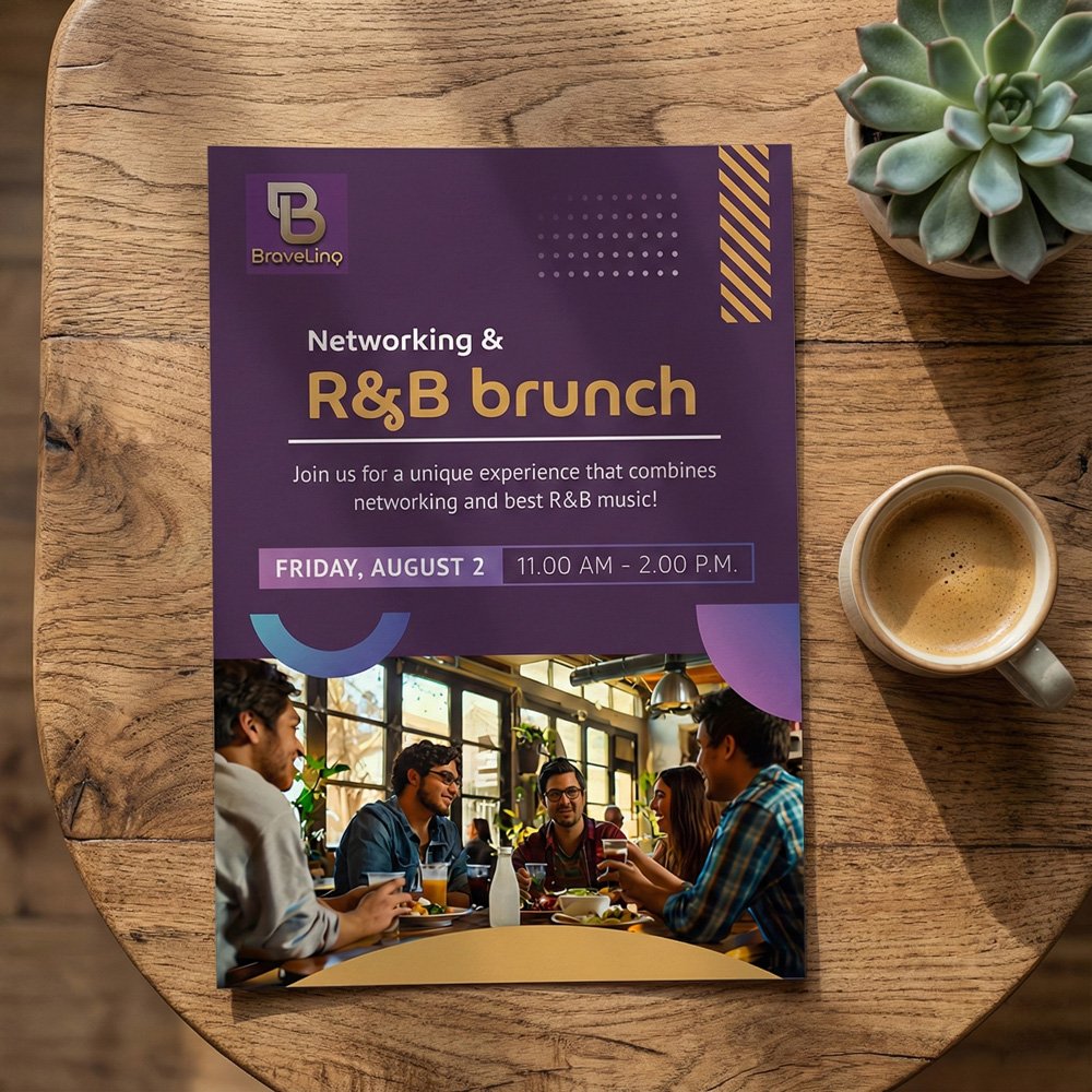
Logo: The mark is a geometric “B” monogram built from interlocking linear forms with a gold finish — a deliberate choice to signal premium positioning without feeling stiff or corporate. The combination of deep purple and metallic gold creates immediate contrast and warmth, two qualities that work together to suggest both sophistication and approachability.
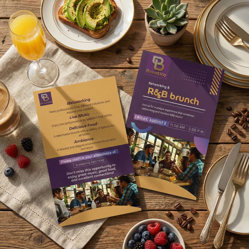
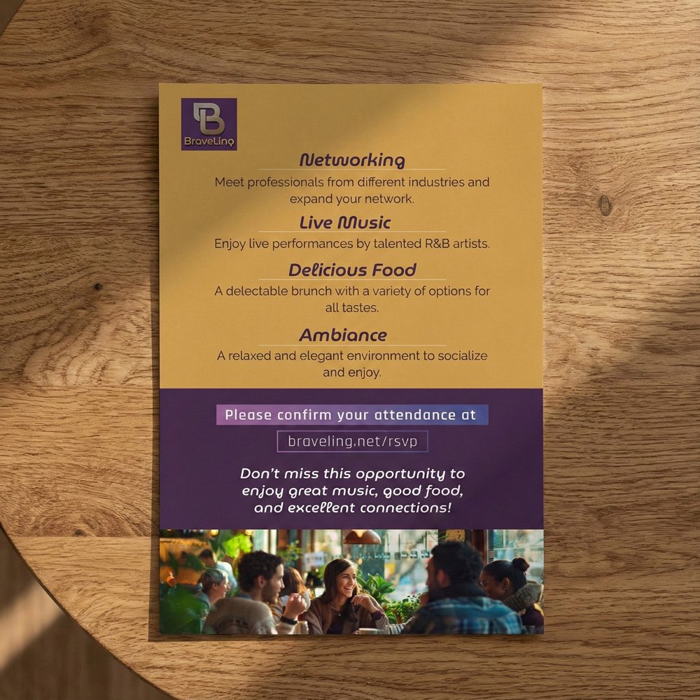
Color system: Purple and gold is an unconventional pairing for a networking brand, which is exactly why it works here. Purple carries cultural associations with creativity and ambition; gold communicates value and exclusivity. Together they carve out a distinct visual territory in a space dominated by blues and grays. I carried both colors consistently across all collateral to build recognition across event editions.
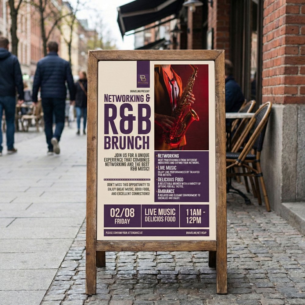
Flyer system: I designed two distinct flyer formats for different distribution contexts. The first — a dark purple vertical poster — leads with the event name at maximum scale, using a bold condensed typeface to create the visual energy of a concert poster. It’s designed to stop the scroll or grab attention on a wall. The second format flips the logic: a warmer gold-dominant layout with a centered typographic hierarchy, built for print handouts and table cards at the venue. Same brand, different jobs.